
Research | Strategy | Branding
A powerful and meaningful brand
Children’s Hospital Foundation is a trailblazing force in kids’ health, dedicated to funding cutting-edge treatment, vital research, and world-class healthcare for children facing all illnesses, injuries and conditions, throughout Queensland and northern New South Wales. Raising tens of millions of dollars every year thanks to a dedicated team of over 50 staff and a passionate collective of donors, volunteers, friends and partners, the Foundation holds a special place in the hearts and minds of many.
While the Foundation had changed over the years, growing bigger, more prolific and extending its reach – the brand had remained in the past. There were stories that weren’t being told, messages that weren’t getting heard, a design system that had become a hindrance instead of an asset.
The rebrand project spanned deep research, strategy development, a compelling narrative, a tailored design system, and comprehensive implementation and documentation. At its core, it was about helping the Foundation unearth what it was that made it unique, then harnessing the power of brand to take that message to the world and amplify the impact of every donated dollar.
Research approach
The project started with a comprehensive research and immersion stage. Delving deep into the inner workings of the Foundation, we meticulously reviewed over 1,000 pieces of material and conducted over 100 hours of on-on-one interviews and co-design workshop sessions.
We spent time in wards and treatment rooms and undertook a comprehensive competitor analysis, studying other charity organisations at a local, national, and global level.

Foundational message
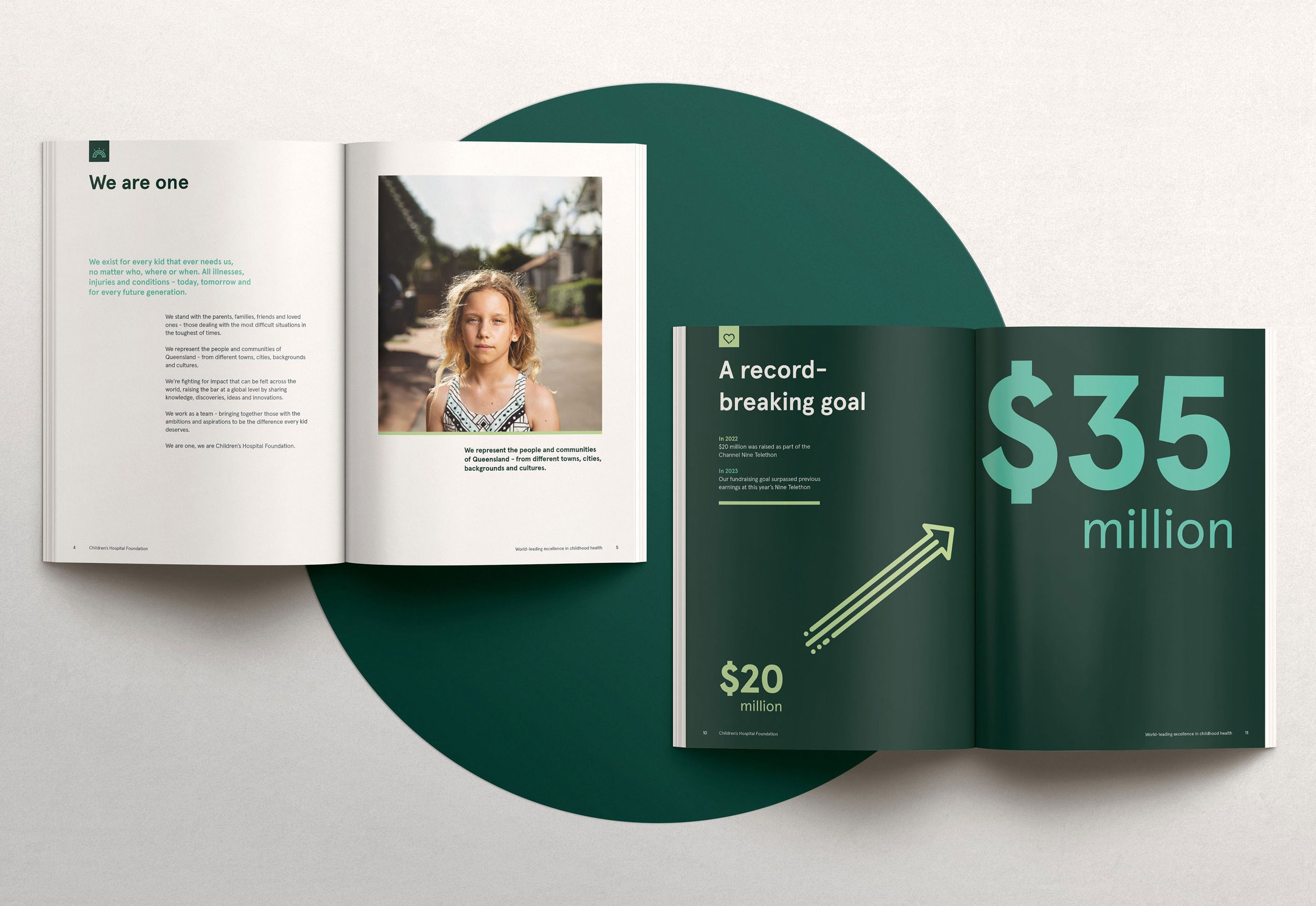
At the core of the strategy sits a unique foundational message centered around three simple, yet powerful words that embodied the essence of the Children’s Hospital Foundation – Equity, Excellence and Impact.
‘Equity’ speaks to the Foundation’s unique position as the only children’s charity in Queensland that helps kids with all conditions, illnesses and injuries from all social and cultural backgrounds.
‘Excellence’ is about the Foundation setting the bar high, serving the top children’s hospital in the country as champions of innovation and achievement.
‘Impact’ is the reason the Foundation exists – to make sure every donated dollar is maximised to its full potential, making a meaningful and measurable difference to sick kids and their families.


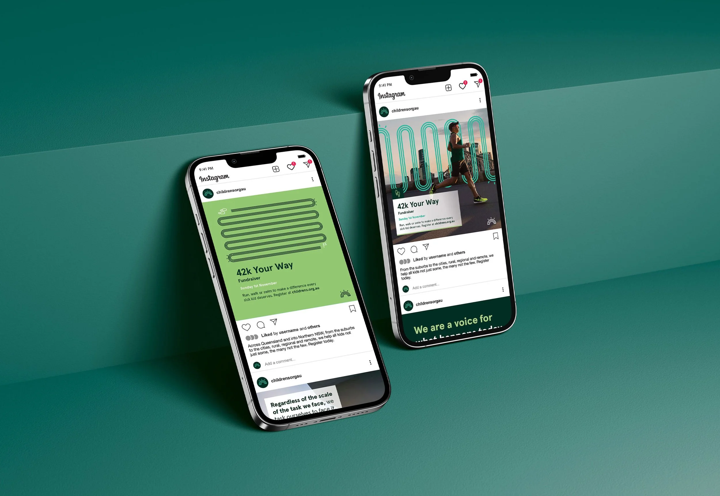
Building brand recogntion
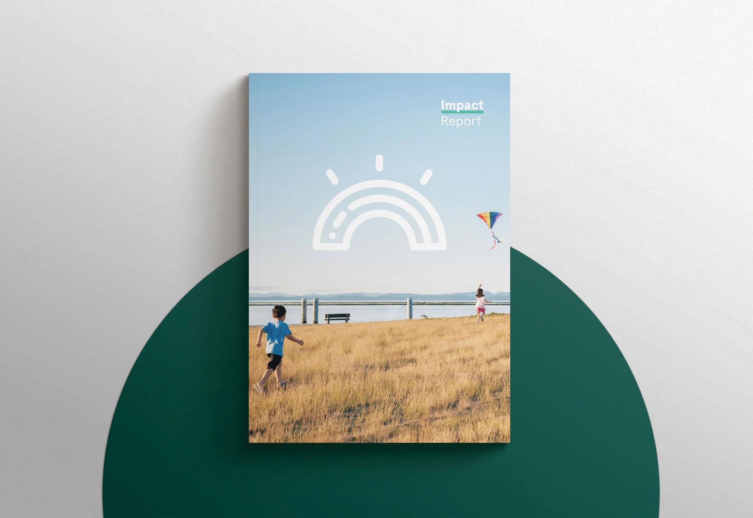
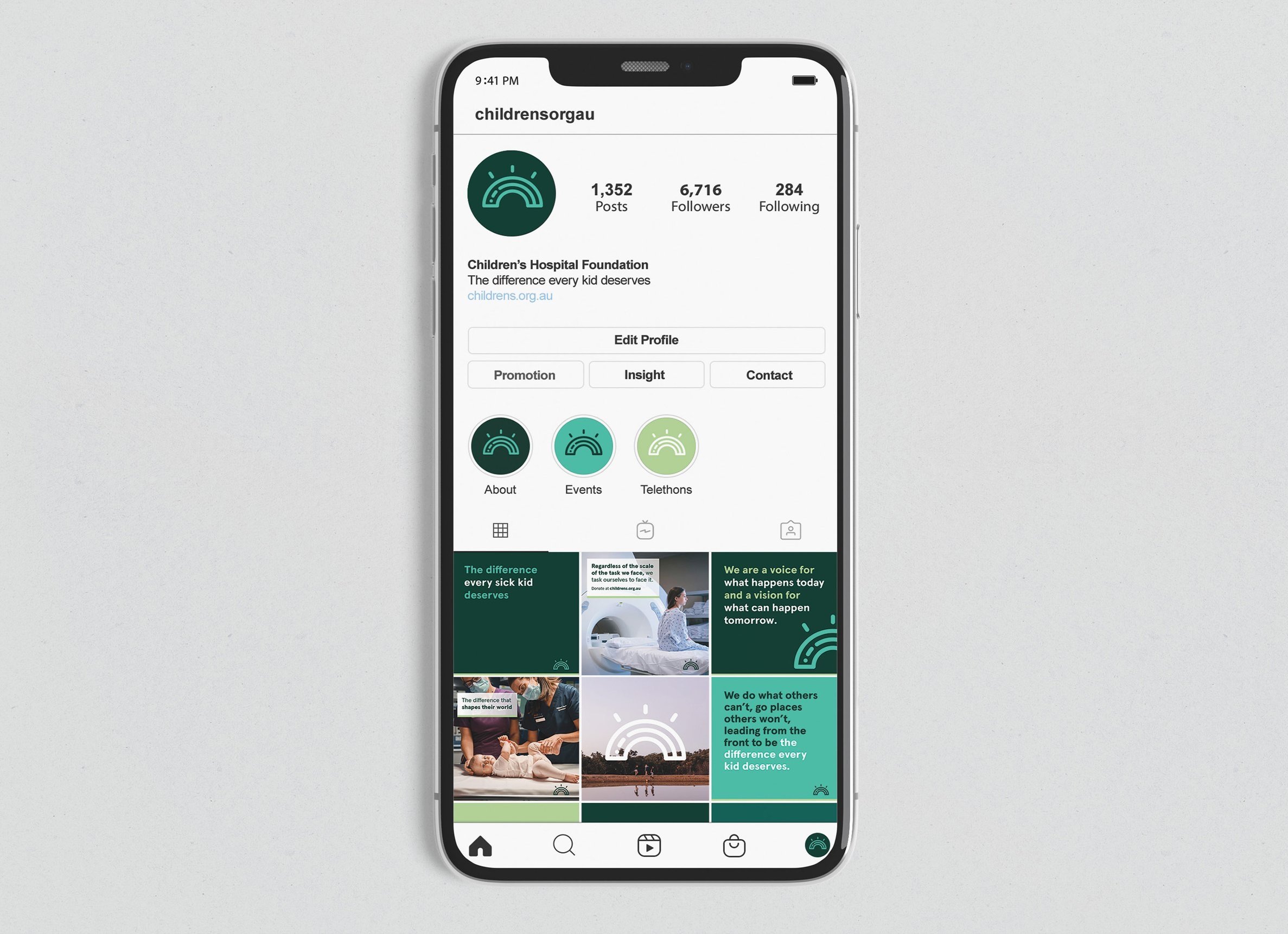
A primary objective was to address the lack of brand recognition and differentiation. We implemented a ‘narrow brand’ strategy, focusing on creating a select number of distinctive ‘sticky assets’ that would make the new brand consistently recognisable across all touch points. This included a logo system, a ‘green rainbow’ colour palette, dynamic typography and imagery that is authentic and honest.


A cohesive design system
We resolved the brand portfolio by adopting a more focused approach, eliminating the need for new logos via simplified and cohesive typographic sub-branding portfolio strategy and execution. We also developed a comprehensive design system and style guide that provides detailed and descriptive instructions for consistent brand implementation. The system was tailor-made to suit the team’s resources and capabilities.


Branded content just for kids
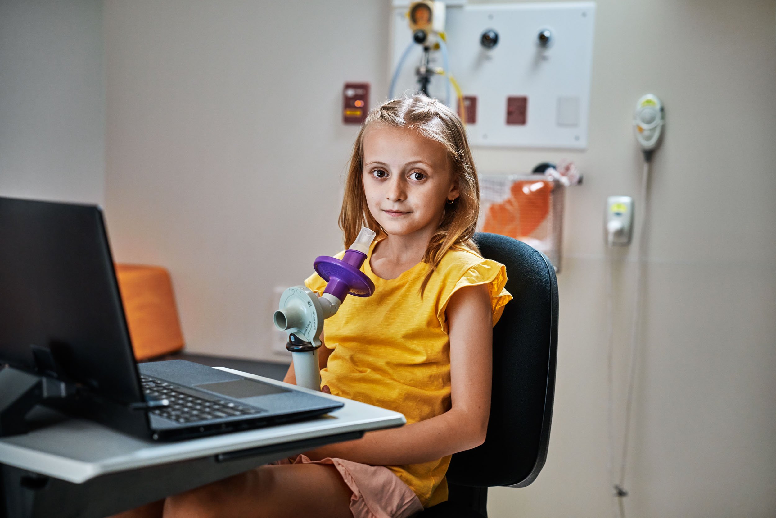
Children’s Hospital Foundation has an army of volunteers working in the Queensland Children’s Hospital, delivering support and services directly to patients and their families at vulnerable times in their lives. A unique space in the brand was required to speak directly to kids in a way that was sympathetic and appropriate. A creative and surprising approach was developed, providing a whimsical, playful distraction to the hospital’s young patients during their healthcare journey.


Impact
Rebranding a children’s charity comes with a huge amount of responsibility – rarely is there so much at stake. The risks are high, but the rewards can truly be life-changing.
In the first few months after launch, the new brand achieved a number of positive results, including some significant increases in the Foundation’s online marketing:
12% increase in audience growth*
33% increase in social engagement*
82.5% increase in social video views*
*Figures are for 1 April - 30 June 2023 compared with 1 April - 30 June 2022
The new brand now gives the Foundation a powerful, meaningful and consistent message that truly represents the organisation as it exists today.

The Children’s Hospital Foundation rebrand has won ten national and international awards.
Australian Good Design Awards
The Australian Good Design Awards showcases the top design and innovation from Australia on an international scale.
Winner | Design Excellence
AGDA Design Awards
The AGDA Design Awards recognises the best work across a wide range of disciplines in Australia.
Finalist | Design Effectiveness
BETTER FUTURE
BETTER FUTURE is the world’s largest network of design award programs.
GOV Design Awards
Silver | Identity and branding
Sydney Design Award
Silver | Identity and branding – Community
Wild Design Awards
Silver | Identity and branding
Muse
The Muse creative awards is a global advertising awards platform celebrating excellence and innovation.
Gold | Brand Identity
Transform Awards
The Transform Awards honours and rewards the most innovative, creative and successful brand work in ANZ.
Bronze | Best use of copy style or tone of voice
Bronze | Best creative strategy
Bronze | Best strategic or creative development of a new brand
Bronze | Best visual identity by a charity, NGO or NFP
Transform Awards ANZ, Jury
“The results are certainly positive and the message conveyed is both heartwarming and impactful.”
Testimonial
“Externally, the storytelling has created an emotional connection that is only going to help with our fundraising activities. There is a cohesiveness to our brand now, so no matter how or where you engage with us, we look the same, we sound the same and we have that emotional hook that is so important when you need to reach, engage and inspire people to support you.”
Fiona Mullett
Director of Brand and Marketing, Children’s Hospital Foundation